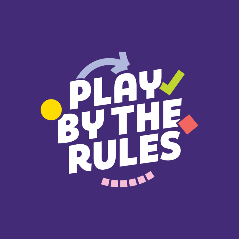
ESA asked CRE8IVE to reimagine how emergency alerts are shared across Canberra’s diverse audiences. The goal: clear, consistent visuals that could cut through confusion, connect with all audiences and drive action – fast.

ESA’s alerts were getting lost in the noise. People weren’t sure which messages applied to them, what level of threat they faced or how they should respond. This confusion was amplified for culturally diverse communities and those with accessibility needs. ESA needed an alert system that delivered clarity in the moments that matter most.

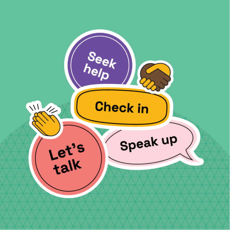
We started with people. Interviews and testing with Canberrans from all walks of life – including older Canberrans and those with vision or language barriers – gave us insight into how alerts were being read, interpreted and ignored. This research uncovered the need to simplify, sort and standardise.

We used our research to build four alert templates including iconography and infographics designed for clarity – optimised for every channel (from roadside screens to social media feeds). We focused on colour contrast and palettes for maximum accessibility. Each template put the most important info first, gave people clear actions to take and could be adapted in real time.

The new system gives ESA the tools to communicate with confidence. Each alert now tells people what’s happening, who it affects and what to do next – without overwhelming them. With fixed structures and editable fields, ESA staff can quickly adjust messaging without risking inconsistency. The system was tested for accessibility, aligned with national standards and designed to cut through.


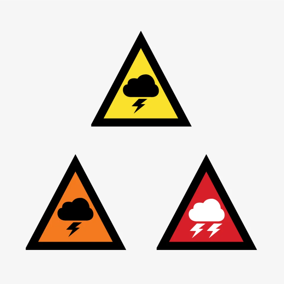
ESA began using the system immediately – and the public noticed. Social media feedback was overwhelmingly positive. The NSW Rural Fire Service adopted action-led messaging after seeing its impact. ESA is now the first Australian agency to use green-coded ‘all clear’ alerts. This project shows how thoughtful design, inclusive testing, and smart systems can change how public safety messages are received – and remembered.